Thursday, November 15, 2012

Some TV Tribute Pixel Art!

Just a few recent pieces of pixel art. I guess I've been watching alot of TV lately, since a good deal of my work is done at home in front of a computer, and have been occasionally doing some unorthodox fanart of my recent favorite shows.


First of all, I've been watching a ton of Supernatural. I used to watch this show when it first aired, but lost track of it fairly early on. Recently a friend showed me a few highlights from later seasons, and I was pretty surprised. It's a surprisingly funny show, not entirely unlike Buffy the Vampire Slayer, and the characters manage to be totally likable and complete assholes at the same time. Good stuff. I'm particularly pleased wth the logo text, and of course their signature car, the Impala, down in the corner there. Turned out very well.


 Next up, Adventure Time! Again, watched this show when it first aired lost track of it, and was surprised to find out how far along its story has gotten! After watching some recent episodes I've been really impressed, but generally the show has had very good writing all along. Jake and the Ice King are my two favorite characters, but Finn is not without his charms.


Finally, a fairly large sprite of Adult Swim's Black Dynamite. I wasn't sure if this show was for me at first, but after watching a few episodes I really have alot of respect for this show. Not only is it funny as hell, but it manages to capture the spirit and feeling of an anime without just aping the aesthetic. I also really respect the high mark they shoot for with their animation, even if they don't always quite hit it.

Anyway that's all for now.


Tuesday, November 13, 2012

Nintendo Power Mentions Me!

Just got a comment from a reader alerting me to my presence in this month's Nintendo Power! It's been months since I sent my work in, so I had actually forgot about it altogether! It's a shame they only printed one image to go with the text, but oh well...

To celebrate, I thought I'd post some of my recent work I've been holding back on!

First, some Castlevania goodness! As part of Game-Art HQ's Castlevania Tribute, I've created two pieces. The first is a tribute to Castlevania 64 hero Reinhart Schneider and his vampiric love interest, Rosa.


I've talked about Castlevania 64 on this blog before, and I still feel that for all it's flaws, this was the last Castlevania game to really nail the atmosphere, challenge, and spirit of the classic games.  With this piece, I wanted to create a sense of drama and sadness. I'm not sure that everything turned out as well as it could have, but I'm generally pleased with the palette and lighting.


 The second piece is a tribute to another black sheep from the Castlevania franchise. Castlevania: The Adventure was the first game in the franchise for Nintendo's Gameboy, produced between Simon's Quest and Dracula's Curse. The game is ludicrously hard and pretty sparse on features, but has some genuinely cool level designs considering it was 1989. Christopher Belmont is possibly the slowest Belmont in the history of the franchise.
 Next up, a tiny piece of Mario fan art. I've recently been playing an absurd amount of New Super Mario Bros. 2, and while many gamers have lamented the lack of innovation, I have to say that the level designs are absolutely awesome. There may only be a handful of new powerups and enemies, but the new stages are intricate and quirky, and I've loved every minute of coin hunting goodness. The biggest draw for me is probably the Coin Block power up, which turns Mario into a fountain of golden goodness. The sensation of speeding through a stage as coin's erupt from your head is truly satisfying. I've cleared every stage and found every Star and Moon coin, but hopefully I'll have time to download and play some of the DLC stages in the future!
 Next up, some more Konami handheld love. I've always been a fan of the Mystical Ninja games, so when I saw the Gameboy game on the eShop I downloaded it instantly. It's a fun little action RPG, but goddamn is it ever hard! The mini-games are absurdly difficult, and the unforgiving nature of the game means that perfection is absolutely necessary. You'll see the Game Over screen so much, it might as well be a character.


Now on to some TV love! I'm about half way through exposing my girlfriend to the joy and horror of Buffy the Vampire Slayer, decided to do a bit of fan art! I've always dreamed of what Buffy would be like as a manga series, so this is my take on a title page. Someday, I may even do a few pages of the actual comic!

Adventure Time is a series I've been catching up on lately, and very much enjoying. My favorite would have to be the Ice King, but generally speaking it's a series with great characters and a surprisingly involved world. I'm eager to find out more and more about the world's history, and the most recent episode has only opened up more questions!

Okay, that's enough new stuff for now.

Wednesday, August 15, 2012

An Awesome Commission


Got something REALLY big to show off today. This piece was commissioned by a friend of mine for use on a Magic: The Gathering play mat, and I'm really pleased with the way it turned out.

For anyone not familiar, this particular scene is from the game Dark Souls, by FROM Software. Anyone that's played the game probably remembers this scene with some dread, as the Capra Demon is one of the nastier encounters early on.

Anyway, just wanted to share this piece, as I'm really pleased with the end results. Can't wait to see this bad boy printed up...

Saturday, August 11, 2012

Good DSi Game! Ace Mathician

What the heck is a Mathician, anyway?
 
So math was really never my strong point. Some of that had to do with my gnat like attention span as a student, as I spent most of my time doodling Saint Seiya and Fist of the Northstar during math class, but I think I can safely say that math and I never really got along. Knowing this, I was somewhat hesitant to download Ace Mathician, fearing that I would lose interest once the math element frustrated me. I'm pleased to say that this was not the case.

Ace Mathician is basically a simple platformer, with an interesting twist. Platforms can be moved by entering an equation, similar to the graphing function on a high end calculator. Luckily, the game only gives players a handful of options in each stage, which are all single screen affairs, so the correct equation or series of equations is never too far out of reach. As the game progresses, levels introduce new elements, including simple enemies, multiple equations, and even some slightly advanced math type stuff. It's nothing you need to crack a text book open for, but it's nicely challenging.

Although it's usually pretty simple to get to the goal, each stage has three gold stars that require some tricky math and careful platforming to  collect. Snagging all three stars in every stage of a world unlocks a bonus stage, and collecting every star in every world unlocks a whole bonus world. There are stars to collect in the bonus world, of course, but they don't unlock anything. The game's gotta end eventually, right?

This is my first experience with Goodbye Galaxy games, but after playing Ace Mathician I'm very interested in checking out their previous work, Flipper and Flipper 2: Flush the Goldfish. The charming pixel art, catchy music, and quirky gameplay make for a very appealing and approachable package, and the $1.99 price tag certainly doesn't hurt.

If any of this stuff sounds interesting to you, I highly recommend you check out Ace Mathician on your DSi or 3DS, or at the very least take a peek at the official website.

Friday, August 3, 2012

Quick Update


Don't have a ton of free time today, so just a quick little post. Got a little tired of doing fan art, so I decided to return to a character I haven't drawn for some time. So here we have Johnny Matchead, former protagonist of my web comic, Basurake, discovering some kind of elder horror.

Like I said yesterday, I might be reposting the comic he starred in, or maybe doing some new ones. I guess we'll see.

Thursday, August 2, 2012

More Super Mario & Luigi

 Sorry this next batch took so long, got a little distracted with other projects.  Before more talk, though, here are the pages.


 Okay, movin' right along! I don't like the way Luigi turned out in that last page, but whatever. I've got the next 5 pages storyboarded, and those should be pretty fun, as we'll finally get to see Donkey Kong. Hope anybody that's reading this is enjoying.

Been keeping fairly busy with various artsy things, some of which I unfortunately can't post here as they are either for paying clients or are part of bigger projects that won't be revealed for some time, but I am trying to make sure I have a good deal of stuff for this site.

Recently I've been going through some of my old comics, and thought I might start periodically posting pages of some of the longer ones, just for the sake of having them readable again. I used to do a pretty long webcomic called Basurake, which I unfortunately had to stop because it was very time consuming and no one was reading it, but I may get back to it just for yucks. I guess we'll see.

In the mean time, here's one more bit of artsy goodness. This is my entry for a Zelda tribute called Link's Blacklist. It's the Nightmare, or Dethyl, the final boss from Link's Awakening. Enjoy!


Monday, July 30, 2012

Amazing might be an overstatement...


This should kinda make sense to anybody that saw the movie. This was all I could think about during the big action scene at the end.

I thought it was okay. Not really very much different from the Raimi movies, I don't think. I do feel like they severely downplayed Peter's nerdiness, though.

Okay, that's it. Maybe something tomorrow.

Wednesday, July 25, 2012

More Comic Goodness

Today's random bit of comic goodness, featuring Dillon's Rolling Western! I thought it would be fun to do a game that was relatively new, and there's a sad lack of attention for this wacky little gem. I've done Dillon fan art before, twice, as a matter of fact, but this is the first time I think I actually got him more or less on model.

This was actually pretty hard for me, because Dillon has a very abnormal body type. Animal people are always sorta hard for me to draw, particularly when they're more animal than people. I'd like to draw more of Dillon in the future.

I desperately want to do a feature on Deadly Towers, as I've found it to be one of the most sadly misunderstood games of all time. It's basically Dark Souls for the NES, and is actually pretty innovative, structurally speaking. I might throw some art together in the next few days highlighting some of the game's cooler elements.

More Super Mario & Luigi coming sometime this week as well!

Monday, July 23, 2012

The Nintendo Comics System

Anybody remember that? It was the goofy label that the old Mario and Zelda comics had in the 80's, along with the Nintendo Cereal System... it was weird times.

Anyway, I sorta miss the days when we got all sorts of weird comic adaptations of games. I have such fond memories of the Super Metroid and Star Fox comics from Nintendo Power, or the amazing Ishinomori Link to the Past comic! It's a feature I think is sorely missing from modern publications, and I like to think here at Doki Doki Arcade I strive to channel those magical days... when I actually post anything, that is.

In keeping with today's headline, here's some new Nintendo themed stuff.

Some cover art type stuff for Super Mario and Luigi. I wanted to post this up with the pages yesterday, but it looked god awful. I reworked it today, and I'm thrilled with the results.

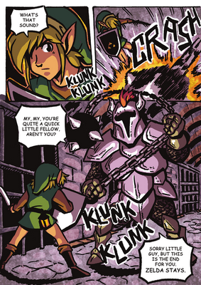
 Not part of a bigger comic or anything, but I wanted to have a go at doing a colored comic. In this case, it's an adaptation of the first boss-ish encounter from Link to the Past. I'm pretty happy with that bottom panel. I loved the ball and chain knight when I was a kid.

Okay, that's it for today. I feel like in my head all of this stuff is building up to some awesome project. I guess we'll have to wait and see!

Okay, well that's it for today!

Saturday, July 21, 2012

NEW COMICS AND SUCH!

A few things today. First of all, I'm gonna try to be a little more on the ball with putting art up here. Not just game related art, but just general stuff as well. I'd also like to start doing somewhat more substantial stuff, like comics with ongoing stories that people could actually follow. I'd like to keep doing Doki Doki Arcade as well, but those are totally dependent on me thinking up jokes...

Anyway, one of the projects I've been working on for a little bit actually IS video game related, and so I'm going to introduce that now. Presenting SUPER MARIO and LUIGI!


More to come very soon, but this seemed like a proper resting point. Any Pauline fans out there (does such a thing exist?) don't worry! She won't be like this the WHOLE time.

Also, just for laughs... I'm playing Deadly Towers. More on that later.

Thursday, June 7, 2012

New Projects + E3 Impressions

Things have been a little hectic, and I've been drafted into a few projects which have taken up a fair amount of my time. First and foremost, I've been asked to do a full graphical overhaul of Flip Industries' Super Kid Icarus flash game. It's basically a Mario All Stars style upgrade to the original, with recolored and reshaded sprites and backgrounds to upgrade the game to 16-bit style. Think Ninja Gaiden Trilogy for SNES, but better.

Here's some samples of the new enemy sprites:


It's coming along nicely.

In other news, e3 has come and gone. Anybody that knows me (or has even taken brief glances at this blog) probably knows I'm a big Nintendo fan, and there's a fair amount of debate as to how they fared this year. Although I can totally see how this year was somewhat underwhelming, I walked away fairly pleased for a few reasons. With a new Pikmin game (finally) a new Warioware, exclusive access to Rayman Legends, a quirky return to insanity from Platinum games, and the first FPS roguelike in the form of ZombiU, I found plenty to catch my interest. Quite frankly, even Nintendo Land, which I initially dismissed, looks like tons of fun.

The big event for me, though, was seeing Castlevania finally make its way to the 3ds in the form of Mirror of Fate. I wasn't totally enamored by the approach Lords of Shadow took to the franchise, but I think that the 3ds followup is looking like a solid game in its own right. I quite like the new designs for Trevor and Belmont, and can't wait to see more of the game as it draws closer to release.


Since I haven't had much art on here as of late, I thought it might be good to seize on this opportunity to get some fan art done. Here's a little piece based on the upcoming Castlevania goodness.

Monday, May 7, 2012

DokiDoki Arcade: The Comic + Kid Icarus: Downsizing Continued...

 So first off, a new comic. I can't help but feel that I'm never going to find any measure of success, like there is something wrong with me that tells people to keep me out of whatever secret club gets you anywhere in life. I guess I'm somewhat socially awkward, and have been the odd man out practically everywhere I have ever been...


Next up, another demake screen shot of Kid Icarus: Uprising. Oddly enough, my last screenshot found a small measure of popularity on the internet after being featured on sites like Pixel Art Guild, GoNintendo, TinyCartridge and Zelda Informer. Pretty cool, but some people expressed concerns that I had passed over the sidescrolling gameplay of the original.

I had always planned on doing an air battle shot, and a land battle shot, but didn't have the time or motivation to finish the land shot until now. Tried to keep the general look of the old game, but with the cool fast paced action of Uprising.

Of course, there's really no telling if this screenshot will ever get the same attention as the previous one (probably not, given that the novelty is gone), but this was something I really wanted to do.

Tuesday, April 24, 2012

An Unusually Batman Heavy Update

Okay, first things first, everybody should go watch Holy Musical B@man! as soon as possible. I know it's practically impossible to sell somebody on this kind of thing, so I'm not going to bother. Just know that if you have even a passing interest in Batman, super heroes in general, the Very Potter musicals, musicals in general, or even just comedy, you will UNDOUBTEDLY like it. If that isn't enough of a sell...
I think I've done my part.

Anyway, moving on! All this Batman talk got me in a Batman mood, and since reading any of the modern comics is basically pointless, I decided to more appropriately nerd out by playing Batman for the NES. Developed by then powerhouse Sunsoft and (allegedly) based on the 1989 Tim Burton film starring Michael Keaton and Jack Nicholson, Batman is one of the best action games on the NES, up there with Castlevania and Ninja Gaiden. It also has NOTHING to do with the movie outside of a few cutscenes, unless I somehow missed all the scenes of the film where Batman punched tiny robots, biker ninjas, and enormous frog monsters before bursting into flames. It's like they just dropped Batman into some random anime NES action game, and it's pretty damn cool. Best of all, they couldn't even wait for Batman Returns to make a sequel, so Sunsoft went ahead and made Return of the Joker, which features EVEN MORE nonsensical bullshit. Was also called "Dynamite Batman" in Japan, which is amazing.

All this crazy nonsense got me thinking about how anomalous those games really were, and about what someone with no prior knowledge of Batman would think of the character based on those games. Can you imagine? Of course, it got me to work right quick on an insane, re-interpretation of the character. I'm still working, but I thought some of these drawings were just too fun to leave on my floor.

Right now, the plan is to do this as a six page mini-comic, which I'd like to actually print and give out for free. I'll keep posting neat stuff as it happens, but for now here's a preview of the cover (maybe) and the first page.
 
And, just for fun, here's a REALLY OLD Batman drawing from when the Dark Knight came out, to illustrate exactly what I'm NOT going for with this new comic...
THE END!

Monday, April 9, 2012

Deadly Premonition Demake

This is probably my most involved demake yet. For those unfamiliar, this is a scene from the cult game Deadly Premonition, a bizarre adventure game by Access Games and director SWERY. The actual game itself plays pretty much like a combination of Sega's Shenmue and Capcom's Resident Evil 4, and is notable for its strange characters, quirky script and gameplay, and surprisingly intriguing story. I recently finished it in its entirety, and immediately set forth to do a series of screenshots.

This one was a bit tricky, because I was working against instinct in alot of ways. Visually, I wanted to give the appearance of an old adventure game, like the Super Famicom version of Clock Tower, or some of the Sierra/ Lucasarts PC games. It's not something I do alot, and everything from the background, which was much more involved than usual, to the characters, who were more realistic than usual, presented a unique challenge. I spent forever tweaking the portrait shot of York trying to get a better likeness, though I still am less than fond of the result.

The rest of the image, though, I quite like. The actual character sprites turned out quite likable, and the background came together pretty well.

Maybe more in the future.

Sunday, April 8, 2012

Dim Souls

The Gaping Dragon the only part of Dark Souls that I really remember fondly. Yeah, he fought pretty brainlessly, and basically just would one-shot you if you were dumb or unlucky enough to actually get hit, but he was cool looking, genuinely disturbing, and every original. Unlike alot of the other enemies, who I just thought were a bit lame, the Gaping Dragon  actually freaked me right out. Everything about that encounter was just cool.

Done to emulate the Gameboy's aesthetic. Don't know why, but I really enjoy the low resolution, monochrome look.

I might make more of this one, actually.

Wednesday, April 4, 2012

Super Halo Advance 3: Combat Devolved


I was never a big Halo fan. The sortof "us vs. them" story of the first didn't really excite me, but by the time the third game rolled around and the Chief was working together with the Arbiter, I started to warm up to the dynamic, plus enjoyed the fact that it made the second player an actual participant in the story, and not just Copy MC. I haven't really enjoyed any of the games since then, either, so I really wish they'd explore the Covenant/Human dynamic again.

This started as an old school FPS, like Doom, but I didn't much like the way it was shaping up. It didn't quite match my actual feelings about Halo, and due to my unfamiliarity with the franchise, I wasn't really able to replicate the details of the weapons and armor convincingly. Discouraged, I thought about my actual experience with Halo, and realized that it had more in common with games like Smash TV, Commando, and Contra (games I had always loved playing in co-op) than Doom, at least as far as I'm concerned.

Natural environments are pain, and I'm not great at doing tiles. I think the individual elements of the background turned out good, but I'm not thrilled with the way it all came together. I think I'm just not a big enough Halo fan to really pull this kind of thing off. Still, it was fun, and I really like the sprites of the Master Chief and the Arbiter.

Tuesday, April 3, 2012

Some Kid Icarus Fun

I've been playing alot of Kid Icarus: Uprising, and felt compelled (as usual) to get to work on a quick demake. In this one, I went a bit further than usual and tried to emulate the sprite scaling Mode 7 effect the SNES was famous for introducing to the console scene, in order to replicate the Space Harrier type stages from Uprising. The extreme perspective and chunky scaling on the background elements and enemies were meant to create the effect, although I'm not totally sure I succeeded.
There were a few specific inspirations for this set up, most notably the gorgeous SNES shooter Axelay, and HAL. Labs' early SNES game Hyper Zone. Neither game is remembered very well, but they most accurately reflected the look I was shooting for. Hyper Zone in particular seemed appropriate, since Masahiro Sakurai, the big man at Sora Ltd. behind Uprising, was once a member of HAL.  I suppose the real idea here is "what if Sakurai had gotten to make a Kid Icarus game back on the SNES?"
Ultimately, I'm not sure I really hit all the notes I wanted to, but I'm overall pleased with the result.
 

Wednesday, March 28, 2012

More Rolling Western Fun


Not sure what it is in my brain that makes me compelled to do this kind of thing, but here's a little mockup of Dillon's Rolling Western, had it hit back in the olden days. Honestly, I just drew up a random square for the screen size, this isn't like, official snes or gba resolution. Just a fun, old school sprite romp. Plus, Dillon just looks so badass!

I might do more Rolling Western art in the future, as I'm quite in love with the characters and gameplay.

eShop Fun + Crossover Epicness

I've had Swapnote for quite some time now, but I honestly never got a chance to use it. None of my friends were early adopters of Nintendo's new handheld, and I didn't think to pursue the friend codes of strangers via the internet. Thanks to a miraculous price drop at Target, though, two of my close friends finally knuckled down and got in on the fun!
We had every intention of hitting multiplayer games hard, and so Kid Icarus Uprising, Mario Kart 7, and even Star Fox 3D were purchased in the necessary amounts. Despite having access to these heavy hitters, it was the free messaging application, Swapnote, that captivated our interest most. I'm not sure why, but this little gem has been an endless source of fun, and a veritable factory for personal memes. It's amazing, and I'm GENUINELY upset I didn't get to experience it until now.
Here's a typical Swapnote between myself and my brother:
A hideously deformed Kirby greets me in page one, perhaps saying something like "I'M NOT KIRBY."
The hideously deformed Kirby's face will contort into a frightening expression of agony in page two.
By page three, blood begins pouring for ugly Kirby's eyes and mouth, eventually filling the screen.
Page four is probably blank, save for the words DIE written in 3D.

I'm not sure why the blood thing is so funny, but in this context, it really, really works.

Monday, March 26, 2012

Quick Update, Explanations and Excuses


First things first, I finally downloaded Dillon's Rolling Western, and it kicks ass. I want to get into more details about that, but first some excuses.

So obviously I haven't posted a new robot master comic in quite some time. I totally still intend on doing more, but unfortunately a rather important project turned up, and all of my time has been going towards completing it. Anything I've posted lately has been whatever I could get done in my spare time. In the near future, I would, however, love to restart the robot master comics.

THAT SAID, I'd like to get back to Dillon, who as I mentioned above, kicks ass. Alot of people are calling this a tower defense game, and in alot of ways it is. Granted, I'm quite early in the game, but at present I feel a more accurate description of the gameplay is likening it to one of those little wind up cars you had to pull back before it would go. Remember those? Okay, so take one of them, and then add in combo based battles, open world exploration, resource management, RPG  style equipment, and light tower defense, all wrapped in a wacky, wild westy cartoon. THAT'S Dillon's Rolling Western.

Did I mention it kicks ass?

Wednesday, March 14, 2012

Pandora's Tower NES De-Make

I took some time to explore the soundtrack to the upcoming Wii action RPG "Pandora's Tower" from Nintendo and Ganbarion, and after some reading up on he game's mechanics, I have to say I'm pretty pleased. From what I've read, seen, and heard, Pandora's Tower looks to be not only a fun, original action adventure, but a better successor to Castlevania than many of the franchises' recent installments. The large, non-linear castle to explore, the multitude of weapons to find and craft, the dynamic chain whipping and swinging action, the slightly twisted dark fantasy story and choral, gothic sound track all combine to form a package that has me thinking that Pandora's Tower could potentially be the game to finally fill the Castlevania void.
This got me thinking about the possibilities of Pandora's Tower as a classic NES game, which got me hard at work making that vision a reality. I had pretty limited info to work on in terms of the game's specific mechanics, but tried to make do with what I had. It's obviously patterned after the NES Castlevania games. Probably the biggest challenge, though, was resisting the urge to more closely replicate the game's look. I wanted this to look like the simple, classic game that inspired the modern epic, not the other way around, so I took great pains to no be TOO accurate. Unfortunately, the game has such an unorthodox sense of design that it was quite difficult.
In any case, this game is coming out in Europe this summer, and hopefully in the US sometime after that. I urge anyone that's a fan of gothic action games of old, be they Castlevania, Demon's Crest or Actraiser, should look into Pandora's Tower.

Wednesday, February 15, 2012

Sorry I'm Late!


Yeah, a little cheesy, but better than using them to buy one of those stupid feathers, right?

Robot Design Challenge Week 2


I'm sure anybody following along has probably gathered by now that I have only the most loose understanding of the phrase weekly.

Seriously though, I wish I could get these done on a better schedule, but work and personal things just keep interrupting! Hopefully we'll get on some kind of schedule before 8 weeks are up!

As always, please continue to send your ideas and feedback!

Wednesday, February 8, 2012

Doki Doki Arcade: The Comic

Haven't posted one of these in a while, so I thought I put something up today. Still waiting for a bit more suggestions for this week's design contest, but hopefully we'll have more on that later.

I really did spend ENTIRELY too much time playing Pokemon when I was in middle school. Like, I had always been something of  a dawdler in school, always daydreaming about this or that, but I was never quite engrossed in anything quite so much.

I was REALLY into StarWars in elementary school, owing largely to the special edition rereleases. Still, there was only so much one could do with it, outside of watching the movies over. There was no (good) animated series, there hadn't been any worthwhile games since the SNES games, except maybe Dark Forces... other than reading expanded universe novels and comics, which weren't always so interesting.

With Pokemon, though, there was an infinite amount of time you could sink into it. Between the games, the cards, and the cartoon, there was just so much to do. Too much even.  I am no exaggerating at all when I say Pokemon was the sole purpose of my existence for maybe 6 or 7 months.

Tuesday, February 7, 2012

25th Anniversary Robot Design Contest Week 1

Woo, sorry about the delay. Got swamped with work at the end of the week/weekend, so the dialogue for this one didn't get inserted until last night.
There you have it! Week 1 complete! Please continue to send your ideas, either here or on Deviantart!